


In downtown Minneapolis on Nicollet Mall, and on 6th and 7th Streets between Nicollet and Hennepin, you can find a few pieces of highly functional public art, utilizing a nontraditional medium: manhole covers, designed by artists between 1983 and 1990. The first group of these covers is from 1983-84, the work of 11 different artists, and the second set is from 1990, all designed by a single artist. According to this overview in the Skyway of Love blog, they were at one time apparently the city of Minneapolis’s most-asked-about pieces of public art.
With the exception of some mentions on photo and downtown-focused blogs, they seem to have largely fallen out of the public eye. At a certain point – maybe after 10 years, maybe after 20 – a piece of public art is absorbed completely into its surroundings. In a sense, to not notice a piece of public art is the greatest compliment you can pay it. Good public art isn’t supposed to be obtrusive or needy. It’s supposed to complement its surroundings, and these manhole covers do just that. Most people walking over or around them downtown don’t seem to notice them, but they’re ready to be noticed when someone is taking the time to observe their environment.
Though they may have been a subject of intense inquiry for Minneapolis’ citizens, information about the manhole covers is pretty sparse on the city’s website in 2013 (only this PDF self-guided tour makes mention of them). You have to use the Internet Wayback Machine to see the full, illustrated listings for the 1983-84 covers on the city website circa 2002. Low-profile or not, though, this cluster of manhole covers – along with the other non-artist manhole covers – can tell us a great deal about the city’s sense of itself over the years.

Most manhole covers weren’t designed to look particularly appealing. Manhole covers can stay in use for decades, and so most are simple, pragmatic designs that are meant to be stepped on and driven over for 30 years at a time. There are still quite a few not-unattractive covers reading “N.S.P. CO.” in a heavy, all-business sans-serif. They’re reminders of the old Northern States Power Company, before it became Xcel Energy. I wish Xcel Energy Center were called “Northern States Power Center,” but then again, I wish the Wild were called the North Stars or the Fighting Saints. Oh well. It is jarring to realize that manhole covers are old enough to outlast the company that placed them in the street to begin with. I saw another one that looked even older, bearing the imprimatur of the “TCWC,” whatever that may have been. I presumed it must stand for “Twin Cities Water Company,” but that doesn’t ring any bells on Google.

Of course, there are plenty of sewer department manholes, too, bearing the familiar “City of Lakes” Minneapolis logo that consists of those two spiky sailboats stuck together.
None of which is that compelling, right? City officials must have thought the same thing. In 1983, they selected 11 artists out of 460 applicants to create designs for new manhole covers around the theme of “entertainment in Minneapolis.” Thirty years later, they’re all still in place around 6th and 7th Streets, testaments to the durability of the manhole-cover medium. That may be the most compelling thing about them, the fact that in terms of wear-and-tear, they have a fairly timeless quality to them that you don’t typically associate with city infrastructure. In terms of aesthetic quality, they’re all over the place – in fact, the best ones are only loosely related to the theme – but many are quite good and hold up as both artifacts and as living pieces of art.

On 6th Street near City Center is a cover designed by the husband-and-wife team of Marcia Stone and Wes Janz. Apparently now living in the other -Apolis, in Indiana, Stone and Janz’s design tosses the shapes of all of the city’s lakes against a wall, and spells out “Minneapolis City of Lakes” in a splattery water font in front of them, slanted at a jaunty angle. This design plays an interesting trick of history. Fifteen years ago, it may have looked ridiculously dated, but in 2013, it so effortlessly captures a certain early ’80s new-wave cool that it now looks completely contemporary. I can imagine walking into Transmission at Club Jager on a Wednesday night and seeing a 22-year-old kid wearing a purple t-shirt with this graphic on the front in teal.

Nearby is an old-timey cartoon fella, peering out from beneath another manhole, with a little graphic on top of it alluding to the “mini-apple,” our city’s most cringe-inducing nickname. This guy doesn’t mind if you think “mini-apple” is silly, though; he’s giving you an “A-OK” sign. I’m not entirely sure, but I believe it’s the work of Frank Antoncich, a cartoonist and illustrator who died in 1994 at age 88 – the cache of the city website doesn’t include an image under Antoncich’s name, but it looks a bit like some of his other work I can find online. It is so guilelessly corny and endearing that it’s impossible to dislike. I like knowing that if it is indeed Antoncich’s work, he created in his 70s, and that it refers explicitly to 1930s and ’40s cartoon art of his youth. “Guilelessly corny” is a risky aesthetic move, but come on, just look at that little guy. He really wants you to have an A-OK trip to downtown Minneapolis. You know: the Mini-Apple!

Also worth noting: Wayne Salzman’s New Yorker cartoon-styled depiction of a downtown luncheon (as far as I can tell, Salzman is now a painter of Eastern Orthodox icons in Massachusetts). David Atkinson’s grill-out cover, with its brats and burgers, is pretty great, too.
But the best of the bunch is probably Stuart Klipper’s quiet, contemplative cover, right in front of a heavily used bus stop on 7th Street: an “X” marking the latitude and longitude of the spot (“YOUR PRECISE LOCATION”), with a suggestion to “KNOW WHERE YOU ARE + BE WHERE YOU’RE AT.” I actually had noticed this one before, though not knowing it was Klipper’s work. I was surprised to learn it was his – I’m a big fan of his wide-angle cityscapes, and his photos have appeared in this column before. I was doubly surprised to learn that it was as old as it is. I’d always figured it wasn’t more than a few years old. It doesn’t look particularly dated, probably because the graphics and the sentiment are so simple and straightforward.

When Nicollet Mall was redesigned a few years later in 1990, the city undertook a massive public-art project that also included the frosted glass bus shelters that still line the street. The city commissioned Kate Burke, a Provincetown, Mass.-based sculptor, to create a series of designs. She seems to have been instructed to not repeat the theme of “entertainment in Minneapolis,” but stick to what she calls “icons of the state”: ladyslippers, walleyes, apples, oats, Northern pikes.
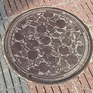
Burke’s work is beautiful, and the covers have a timeless quality to them as well – the presentation of the natural elements, such as the apples or oats, woven together in a pattern-like grid, calls to mind the sorts of patterns you see in a lot of these manhole covers. They bring a sense of easygoing natural beauty to that least beautiful of infrastructure: heavy irons discs covering sewer lines.
That said, I prefer the early ’80s covers. The 1990 covers are, on the whole, stronger, more confident pieces of artwork. But I find the selection of “Minnesota icons” reductive and somewhat limiting. In its self-identity and presentation, I sometimes think that Minneapolis can seem embarrassed to be a city, like it’s some kind of bizarre cosmic accident that there’s a city of 400,000 inhabitants here and not a Hennepin County-sized Lutheran church camp out on the prairie. Loons, pikes, and corn are certainly important parts of the state’s mythology, but I’m not sure if you could say that of the city’s mythology. The vast majority of people using Nicollet Mall and walking around downtown (including me) probably don’t give much thought to loons, pikes, and corn on a daily basis.
What I like about the 1983 covers is that, for all their aggressive whimsy, there is a cosmopolitan quality there that says, yes, here’s our city, with its dancers and lunching ladies and grilled meats and splattery new-wave fonts. It feels more like the Minneapolis I know. As Klipper suggests, it’s good to know where you are, and be where you’re at.
Thanks to super-reader Chuck Pederson for the suggestion.


Addendum
A great addendum for Stuart Klipper, posted to his Facebook wall:
Backstory:
I wanted everything about my entry and proposed design to be totally demotic & vernacular – it was after all going to be one of the most commom place, utilitarian, and down-to-earth items of street architecture there is, a man hole cover fer godsakes!
I wanted the quiddity of my entry and potential product to mirror that. (I guess that is what I thought the whole thing was all about – or should have had been all about?)
What a great discovery!
It makes one eager to walk along our streets looking down, not at a smartphone but at the manhole covers! I had no idea they were there, and thank you for this news.
It reminded me of the mayor’s misguided promotion of expensive artist-designed water fountains for [mostly] downtown, from several years back. How much more lasting, and unproblematic, more artist-created manhole covers would be, especially if they expanded into neighborhoods and reflected local self-perception. We could have artists do them, of course. But they wouldn’t have to be “sponsored” by adjacent businesses, as the water fountains had to be and was a reason for the project’s failure. They wouldn’t get graffiti-ed or broken or otherwise defaced, as was feared or maybe even experienced for the fountains.
We should promote this kind of urban art. It lasts. And I agree: it should emphasize that this is Minneapolis, not a state.
Kate Burke manhole covers
Back in the early 1990’s I first noticed the artistic manhole covers and found joy in searching out the new designs. The loon, walleye and northern pike being my favorites. I recently had a new entry and walkway poured in front of my house and needed to maintain access to a burried electrical junction box that happened to be right in the middle of the designed trellis entry point.
I searched for Kate Burke and inquired about purchasing one of her covers. I was able to secure a casting plate of the loon with great detail and original colors. Kate’s story of the covers and their recognition in art establishments is amazing. We spent half an hour just talking about the project she undertook – what a story. She is a bubbly, wonderful person and the very reasonable price came with a certificat of authentification. It arrived without a scratch and was placed on a one inch lip base for easy future access below (as this was the technical reason for getting the plate).
Much to my amazement it catches the eye of all visitors to my house and transends your definition of great public art not being obtrusive or needy. It is now great private art that is stunningly beautiful and turned a technical problem of access into a highlight of discussion as guests visit my home. So many have seen the covers on Nicollet Mall and quietly held their appreciation of the beauty only to quite joyously find a reason to recount their first sightings of them and talk about their favorites.
Walking tour
Any thoughts about setting up a walking tour that would highlight the covers. Great article.
Thanks Andy for singling me out like that.
As best as I can recall, there were some snags in the production of some of the artists’ covers. Initially, the plan had been to make them in a standard industrial way, in a foundry. But some designs were too complicated and intricate for that, so more costly and elaborate methods were necessarily employed. I wanted mine to seem as close to a ‘normal’ one as possible, to stick within the idiom. My drawing was kind’a crude and whimsical; but, they bought it. Have you discovered who did the judging?